Tuesday, December 7, 2010

INSA Tea Cup and Saucer set

The INSA had a limited edition tea cup and saucer art contest to see which of the top names in art can create the most interesting composition on the cups and saucer. Names like Sylvia Ji, Ron English, and Mode 2 have entered the contest and i would say the bars couldnt be set much higher. The subject matter of each cup is completely differnent and it would appear there were little to no constraints on what or how you could decorate the cup. It says you can buy the cups and saucer for 39 pounds so like 80 bucks? im thinking that must just be a print.. damn expensive cup.. But soo radical, ridiculous to see what some people can do with a brush. I have come to find that Artist research has furthered my doubts in my ability to become a fine artist, the way some of these people can draw is just absolutely amazing. I WANT SKILLS THAT PAY BILLS like these guys. If you take notice to ron englishs set its an Obamination, an Obraham, Obama / Abraham Lincoln, pretty funny although i may disagree with the linkage between lincoln and obama, there goes rons pop art once again. Here are the entries i can find...The show was recently touring the UK at the Modern Tate and several spots in the US but are only available for purchase in the UK!  BUMMER 4 america. On with some examples of cups!


 ron english
INSA

mode 2


Kozyndan


ALSO check out these friggin pillows, forget drinking tea, rest your noggin on some killer colors
http://www.thisisalimitededition.com/

MTO street art extraordinaire


MTO is a graffiti artist from Berlin whos main focus is pop culture, more specifically movie stars with clever twists on characters they have played. One thing that Ive noticed about graffiti artists is their bio is very hard to find, after all im sure they are responsible for thousands of dollars worth of damage so providing his information might as well be providing his bank account number as well to pay for his destruction. His work is exactly what im talking abut earlier postings, he takes a brick wall and adds flare, character, FLAVOR. His subject matter is also very popular readily known characters allowing the everyday passer by to take notice to your piece and its message or there lack of. Painting people from Brad Pitt from fight club to Jack Nicholas in the shining MTO has done it all in truly realistic fashion. I think its ingenious to hide your message behind readily known faces and celebrities, its almost like an advertising tool, a tool that never runs out of ink because culture is always changing and there will always be a new big dog on top. I love these super famous characters and then thier signs that say MTO on it, its a clever way to incorporate your tag with out separating it from your art work.  Below are some of his street paintings, many of which are cleverly placed around door ways and other negative spaces that are utilized into the strength of the overall design, "Gotta love pop culture references"  in the words of Ron English!


 Ron would be proud MTO.... Can you tell what movie these characters are from?

OH you DEVIL blog, Goodbye

The day has come for me to set you free back to the infamous abyss known as the world wide web...Hopefully i will still find time to post the mishaps of my life on you. So group project aren't usually my thing but i got a pretty sick group for the mock museum exhibit, our theme being childrens myth. DECENT topic, i still wanted to explore what it means to be a ethnically challenged cracker but i guess my travels will have to challenge that instead. My two myths are dont eat watermelon seeds or a water melon will grow in your belly and dont run with scissors or they will poke your eye out! Time to put the good ole pottery skills to work and see if i have completely lost it with the gouged eye ball. I will admit im a little worried about the down to the wireness of this project but that seems to be the story with anyone in any sort of art department, gotta love dead week! Im really hoping i can also find some better back lighting for my printed x rays, please co operate time and money!   Well my blog, im sorry if i didnt do you justice, dont hate me.

Alexander Korzer-Robinson

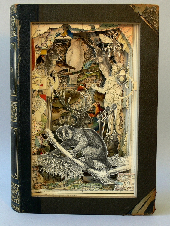
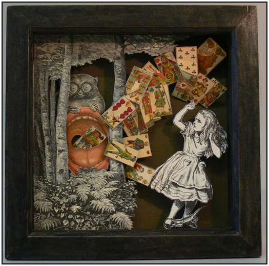
Alexander Korzer-Robinson is an artist from Berlin now residing in Bristol, Germany, with a back ground in psychology his art focuses on the humans "inner landscape". The medium he readily uses is mostly book and exacto knife with a clear coat to seal the book after its done.  His work is really cool and reminds me kind of of those fat tire commercials with all the cut outs if you have seen em. Either way, really cool and just sort of trippy stuff that could never happen in real life, its reminiscent of Salvidor Dali almost really, a semi realistic dream like state of chaos and time. "I make objects as an invitation to the viewer to engage her/his own inner life in order to assign meaning to the artwork." His book art has been made by working through the books, page by page, cutting around and cutting out every single page.. sounds tedious. as a final step he seals the book so its just a window into the soul of the book almost. Super sick, the books just look phenomenal and really questions the boundaries of book altercation.

Monday, December 6, 2010

Robert The

Robert The never planned on being an artist, he was first double majored as a philosophy and math major and was interested in language and logic, things he felt were the "foundations of truth and meaning". He describes his start in art as "I kinda blew a fuse in my senior year—something very strange happened—and I lost my ability to read of a period for a month or two. This sharpened my interest regarding what was actually going on with the symbols that convey meaning on a concrete level. It also unsettled my nerves and undermined my passion to continue with my studies in that particular direction." Interested in unconventional mediums he firstly showed an emmerging interest in letter formation which lead him to working with enamel. After deciding enamel not being physical enough in presence he decided to cut "this" out of a book, which to his surprise sold. Thus his book cutting and altering career started and has blossomed into some interesting results. His art is fairly conventional and simple but its interesting and unique with strong messages behind the piece.

"Books are guns, a dictionary is a noose, and bugs crawl out of covers."
- Robert The

Graffiti mark up


GML = Graffiti Markup Language from Evan Roth on Vimeo.
 I dont know about you, but personally when i see some dipshit tagging a wall to claim his click or krew i get a little upset. Its one thing to say that wall is concrete, plain, and ugly, i will change that, take something ugly and make it better, shit paint it brown for all i care. I dont want to see your 3rd grade hand writing littering the streets, its people like this that give graffiti a bad name, who said that art doesnt belong in the streets? in every day life? Slowly but surely people / Boise are getting it and there are more and more public art pieces around just because, gotta love it. The more art work i notice the more crap tags i notice that have zero time put into them but were simply written to say I was here, ima lil hellion, now clean up after me.  With that said on the other end of the spectrum, i enjoy causing a little ruckus, making people clean up after me, not every one is perfect and who doesnt like the red headed step child of adventure, trouble. This video shows some alternative methods of graffiti and its place within modern technology including a light sensitive photo wall that can be used like a regular wall and displays what your painting, pretty cool :) Sorry to rant, keep taggin, keep destroying,and please take away spray cans from bums and your friends who write like they have a hook.

Shawn Barber


Shawn Barber is a tattoo artist, painter, and portraitist based out of LA, California. Earning his BFA from Ringling he has traveled the world for his shows an exhibits as far from LA as Australia and Asia. His passion has always been tattoos and tattooing so naturally one of his favorite subject matter is portraits of people and the ink they have on their body. they way he can flawlessly create tattooed skin tones is amazing and the texture of the work is flawless. You can tell he truly understands the medium he is using the the medium he is trying to convey which is really saying something about his painting. Barbers paintings of tattoos have been said to be intimate renditions of tattooed individuals balance both meticulous brush strokes and loose energy. Aside from his tattoo portraits he also has a series of dolls that i will show several slides of after the ink portraits that are really creepy and ironic because you would shit your self if your children were playing with these. His plastic like style of painting these dolls is ridiculous in some and often it doesn't even look real.

Hannah Stouffer


Hannah Stouffer was said to have been raised by wolves according to herself, her father was a mtn man giving Hannah a strong appreciation for nature and what it offers. Many of her works pay tribute to mother nature and her experience while being surrounded by such environments. Born in Aspen, CO and Oakland based, Hannah stouffer is blowing up in the illustration scene, she just released a nike 6.0 jacket that is super sick, she recently designed a new gnu snowboard deck, etc. When talking about her work she said "feminine decorative embellishments counter balanced by macabre motifs, the animal kingdom, and the never ending pursuit of illustrating explosive emotional transcendence."  
^  THAT IS IS SICKEST DECK. ^

 
Her style, like most of my artists have a very psychedelic and a heavy influence on the skate and snowboard scene, i dont know how i even keep running across these people. I love this style though, GNU has been promoting styles similar to this since i can remember and i love it, the idea of electric colors and landscapes and things natural is just an amazing juxtaposition.   Below is a few more works of Hannah Stouffers works. keep on creating


DO you see these vans!? 

Saturday, December 4, 2010

Jeremyville

Jeremyville is a artist, designer, and product designer from new york city and is a man of many talents. Using his superior illustration techniques he completes projects from working with adidas, to skate decks, to comic books. He wrote a book about designer toys called vinyl will kill and is now releasing a second publication "jeremyville sessions', a collaboration project between him and many other artists. Jeremyville has worked with clients like converse, rossignol, colette, coca cola, mtv, kidrobot, refill, adio shoes, strangeco, super rad toys,sketchel, adidas, tiget beer, domestic vinyl in paris, corbis, thunderdog, red bull, pop cling, and beck. Many of his pieces have a very comic book graffiti feel to them, the way he displays and shows the streets and people is really cool. his pieces to me seem to be like an urban fantasy land with creatures and cartoon like attributes. Really really awesome work for someone like my self who is really interested in that scene of skate and urban comic book styles. In 2009 he released his converse limited edition shoe that was hand painted, using cutsy cartoon characters, clever patterns and the occasional pop culture reference his style is widely likable and accepted which is usually a good weapon to utilize unless you like the title starving before your official title of artist.


Jeremyvilleeee beck album cover


Friday, December 3, 2010

Paula Hayes

Paula Hayes is a landscape designer and artist who is heavily influenced by the natural things in life, more specifically plants. She uses various materials to house her arrangements but mostly uses blown glass, acrylic or silicone to house a variety of plant life cleverly placed. Currently Hayes has an installment in the Museum of Modern Art which is 15 feet long, horizontal wall mounted sculpture and a free standing egg shape sculpture all filled with lush vegetation. Hayes stresses the importance of the landscape and its impact on her as a child and that she likes to include organic shapes in her peices such the as image below of the peice slug and egg.
When people refer to her art as a seductive art object rather than her interpretation of a garden she likes to say that the its not an object its a verb that will hopefully be a transforming process in the life of these organic objects inside non organic object. The piece above is the largest scale of project she has worked on and most of her project are smaller orbs and jugs made of blown glass with arrangements growing inside of them. Coming from a landscape architecture back ground its really nice to see an artist doing something with the natural and taking time to appreciate something that so many people take for granted.

Light Painting Dean Chamberlain

Dean Chamberlain is a photographer who specializes in lighting effects, more specifically light painting. This type of medium is very sensitive and is used while the cameras shutter is open, light is painted onto the places of desired color.
        This produces a very psychedelic effect and is very unique. Born in Boston, Chamberlain was interested in photography from the age of 13. Dean got very into the psychedelic movement and after attending Sheradin college for only a year knew that his passion was light painting, working very closely with LSD guru Timothy Leary.
        Deans works are very colorfully painted, using vibrant colors and overlaps giving the photo a ghostly trip feel to it. I'm really interested in this medium and am hoping to give it a try this upcoming photography class, i particularly like his portraits of people surrounded by absurd colors.

Thursday, December 2, 2010

Museum Exhibit

   Over the break i had the pleasure of briefly checking out the lay out of my ex-girl friends moms boutique shop.. It was a real joy let me tell you.. The layout of the store is pretty typically to that of the average clothing store, large womens section, two racks of overly bedazzled mens' clothing to which you dont even want to flip that price tag over for fear of financial heart attack.
   The organization of the store is divided into several categories, obviously the men and womens clothing is separate, the jewelry, candles, other random accesories are grouped, and then the clothing is sorted firstly by color then by size. I noticed the flashiest and most expensive items were often set on the mannequins, im not sure if this is because the store hopes to show off the items that pull the most profit or if the most expensive items just look better to rich people. The mannequin was almost always raised above the rest or in the window being sure to provide lots of exposure for its outfit.
    The store flows together like one big bedazzled bitch disco ball from wall to wall, blinged out jeans to some seriously questionable button up shirts for men, If i had not been here before and was completely blind to this sort of thing i would laugh my ass off; truely ask my self wtf is this and how not only can anyone wear this but how you can justify paying this much to look like a walking financial status. SILLY. Unlike a traditional museum, much less is told about the garments sold here, except for the occasional brand tags on the outside and the tags on the inside, much is learned about the material instinctively.


Buy clothes from the 80s from savers... and rock them.